Taming of the design
ACT I: EXPOSITION
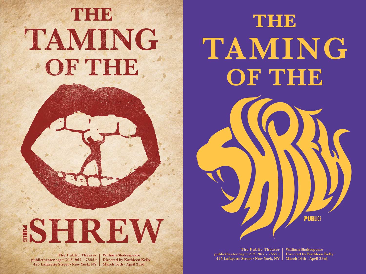
I designed a symbolic and typographic poster for a theatrical production of Taming of the Shrew by William Shakespeare. The goal was to interpret the story’s tension, wit, and dynamic character relationships through a modern and visually compelling identity of the play. My objective was to communicate the emotional heart of the narrative while building a unified, professional design outcome that reflects my conceptual thinking, creative problem-solving, and technical ability.
This project allowed me to explore symbolism, type hierarchy, motion, and storytelling within a single cohesive deliverable that mirrors the expectations of real-world design for theater and entertainment.
Act II: Mind Mapping & Symbols Study
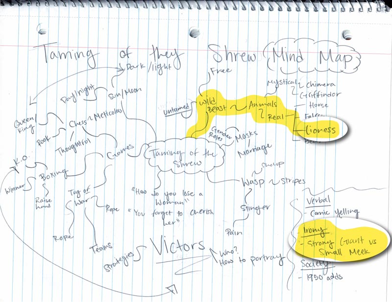
Mind Mapping Process:
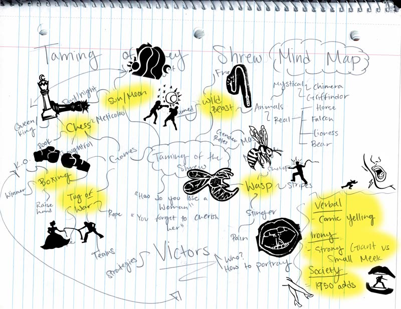
I started by creating a mind map after reading and watching the play. I used keywords and themes to explore the symbolism in The Taming of the Shrew. This helped me find visual connections and develop imagery that matched the emotional tone of the story.
Symbol Capture and Vectorization:
Act III: Sketching the Concept
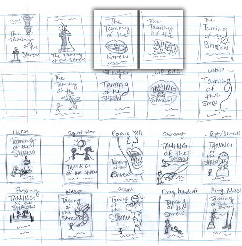
Act IV: Drafting Ideas
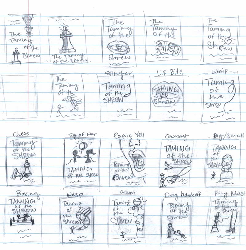
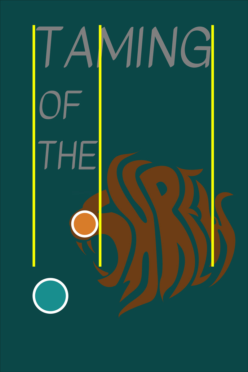
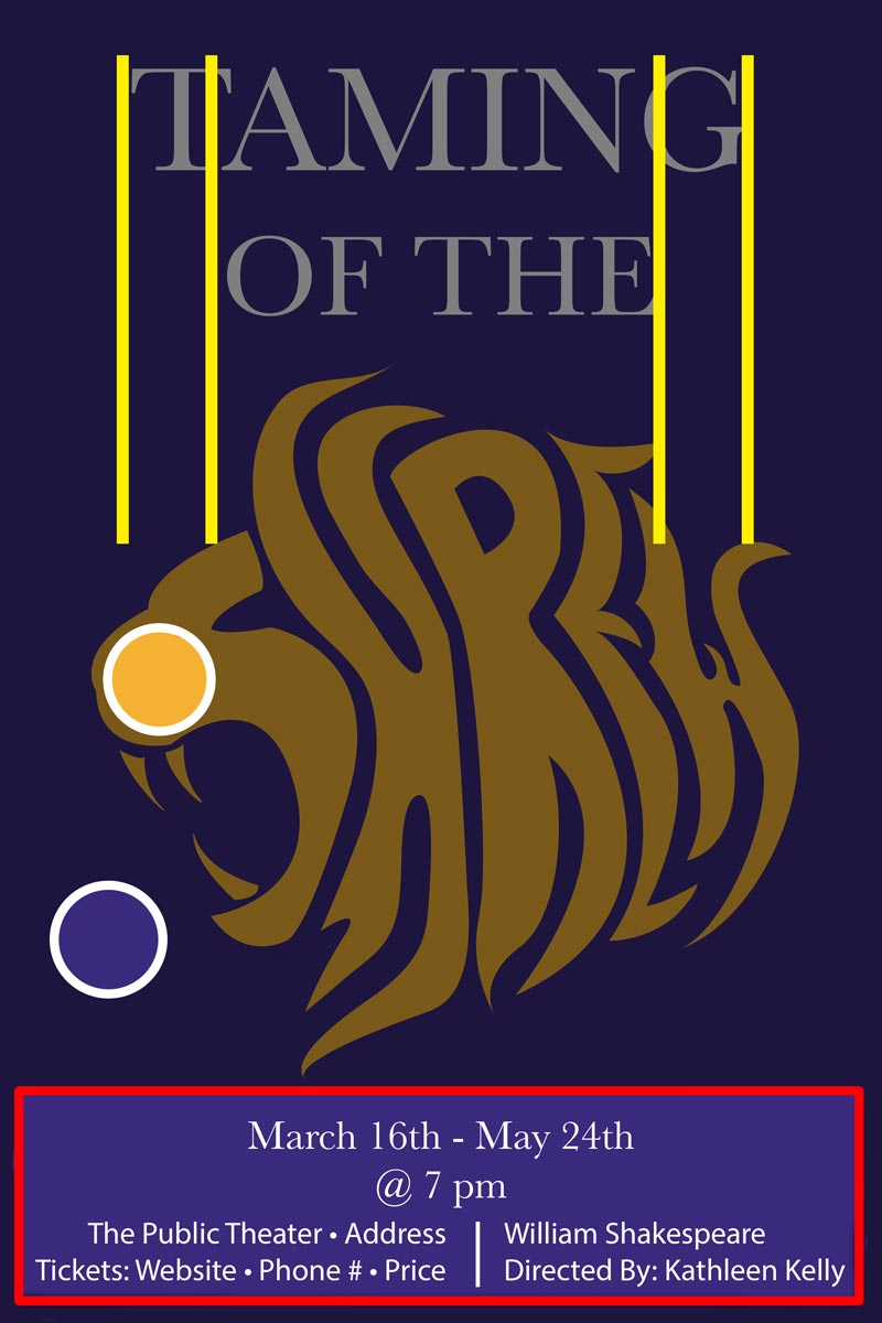
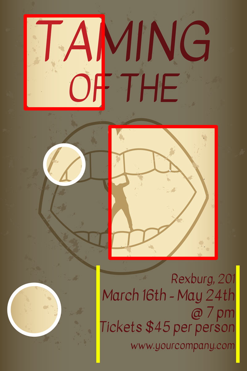
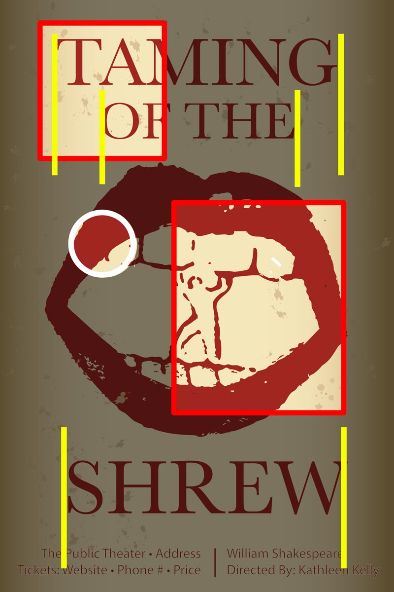
After selecting my strongest sketches, I refined them into vector forms in Illustrator to test alignment, balance, and color schemes. This process helped me evaluate how the symbols worked with typography across different sizes.
Act V: Reflection and Mock Ups
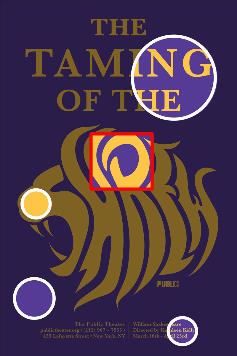
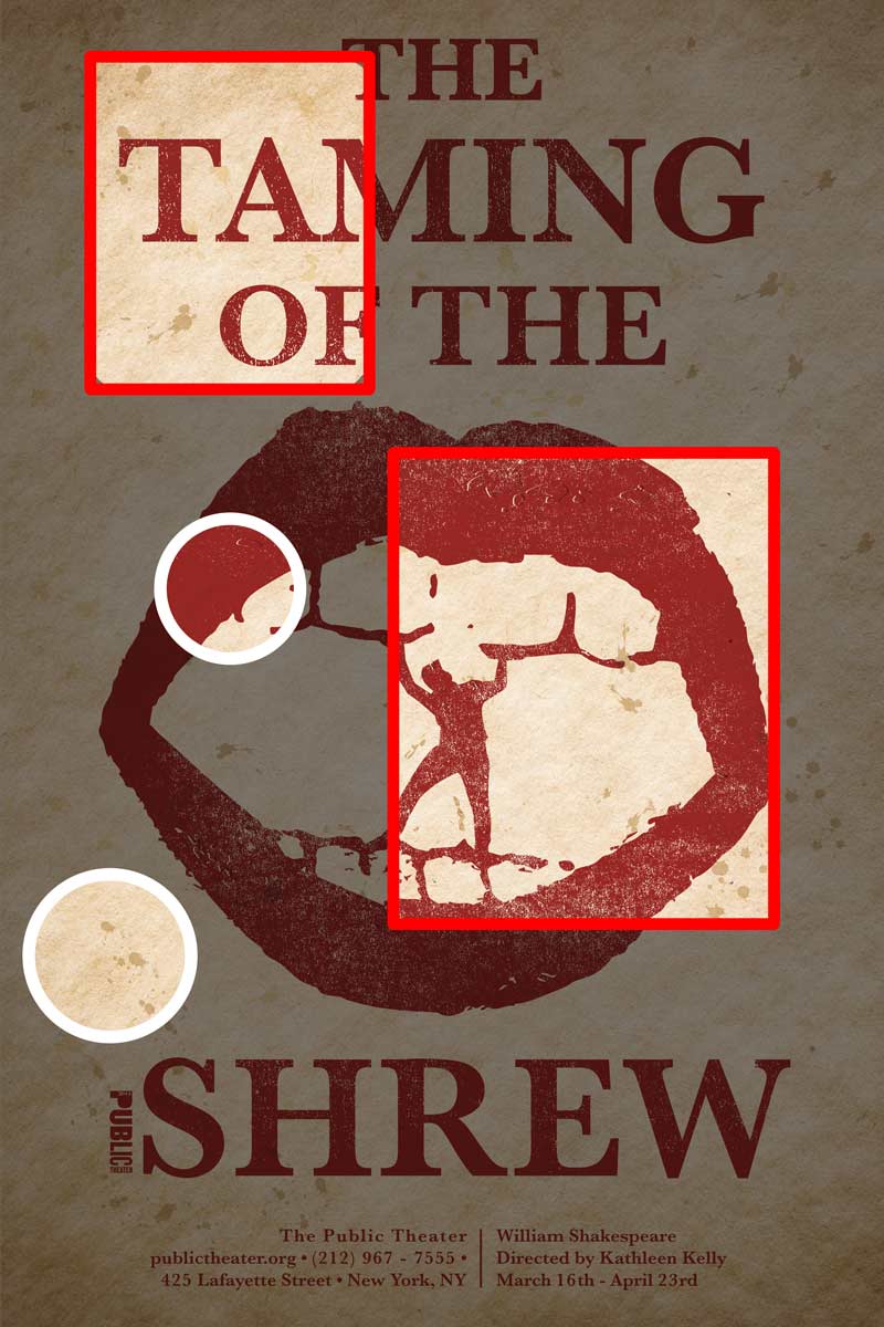
Throughout the critiquing process, I refined the clarity, contrast, and spacing of the symbols. I improved alignment within the composition, adjusted my type hierarchy for better legibility, and refined color values to create a more dramatic tone contrast.
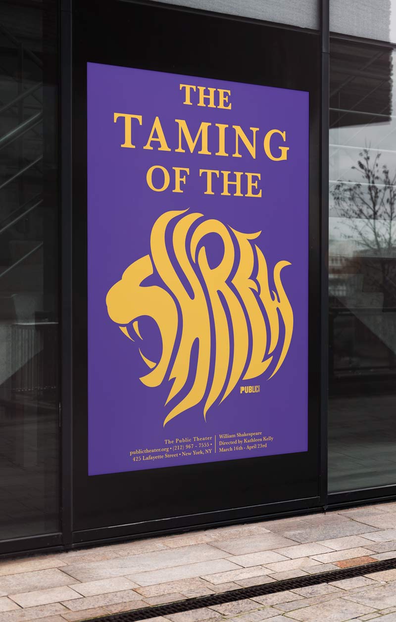
I used the principles of design (alignment, value contrast, balance, etc.) to make enticing and dynamic pieces that attract the audience’s attention. The final composition supports the storytelling of the play through strong symbolic meaning, strategic type hierarchy, and a cohesive visual tone. These designs are able to beautifully translate to real-world scenarios.

Contact:
Behance: behance.net/caitlynjirwin
Email: cjane.irwin798@gmail.com
LinkedIn: linkedin.com/in/caitlyn-j-irwin/
